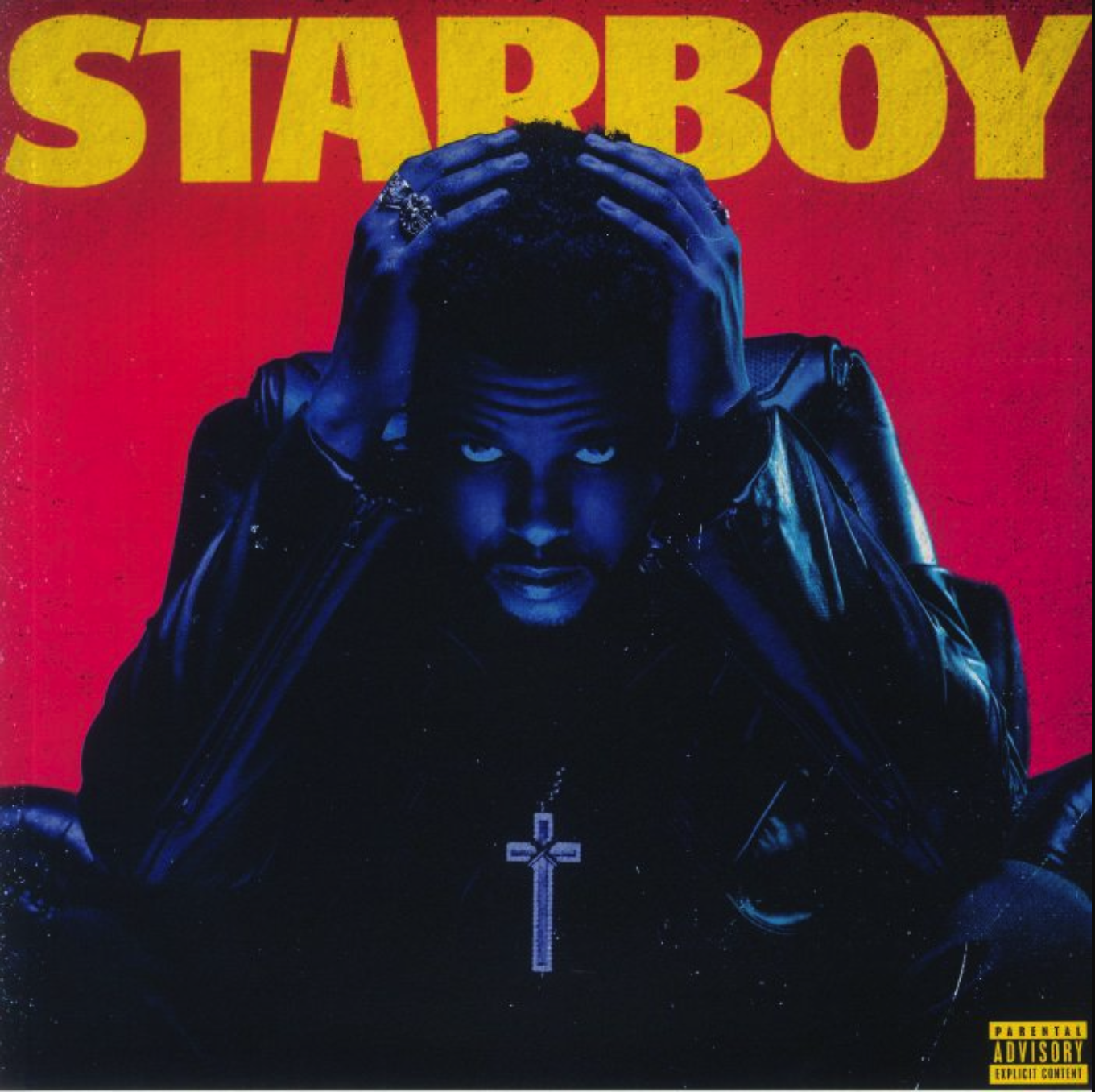
For my Data Visualization project, I chose to explore the full streaming history of The Weeknd, an artist whose career spans over a decade and includes some of the most influential albums of the 2010s and 2020s. Because his music evolves dramatically from era to era, such as moving from dark alternative R&B to chart-dominating pop, his music offers a unique and rich dataset for visual storytelling. I have personally listened to The Weeknd for years, so this project also let me connect something I care about with the skills I learned in this course.
Streaming data is one of the clearest ways to understand a musician’s long-term cultural and commercial impact. Unlike album sales, it updates constantly and reflects actual listening behavior from millions of people. By gathering data from Spotify’s publicly visible stream counts and popularity scores (as of 2025), I analyzed how The Weeknd’s songs perform across 12 album eras, including mixtapes, studio albums, EPs, and the newly released Hurry Up Tomorrow.
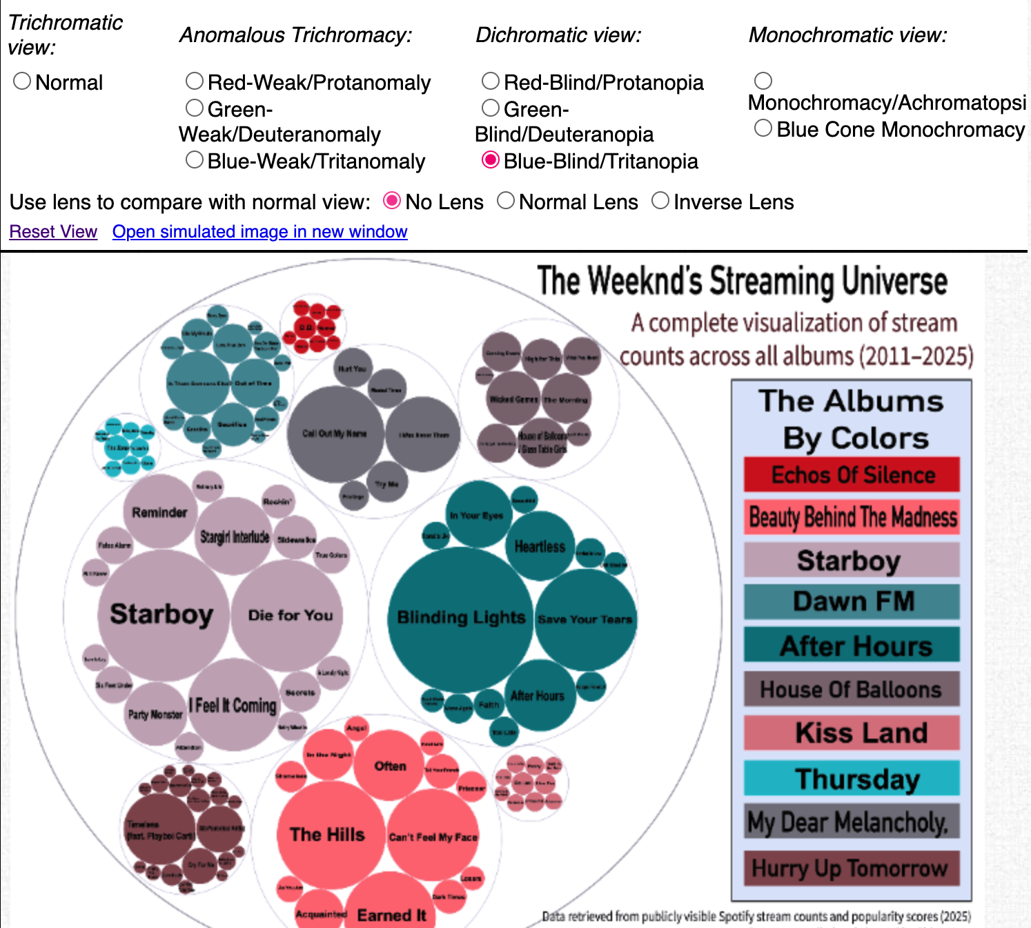
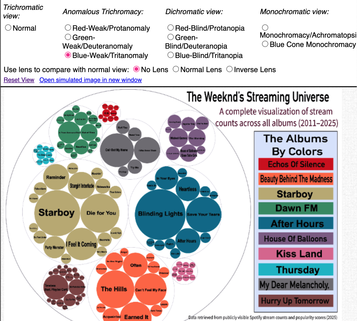
Since the dataset contains over 150 songs and more than 40 billion combined streams, I looked for a visual method that could show hierarchy, clusters, eras, and magnitude all at once. This led me to use circle packing in RAWGraphs, which creates groups of songs by album and scales each bubble by stream count. The result is a clear “galaxy” of The Weeknd’s entire streaming universe. This website walks through my process, of cleaning the data, to building the visualization, to interpreting the patterns it reveals about The Weeknd’s career.
Data Viz Report | Introduction
Data
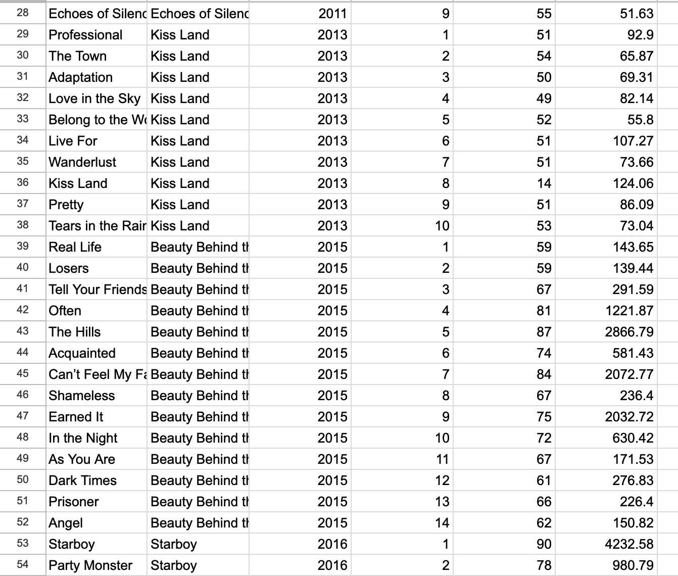
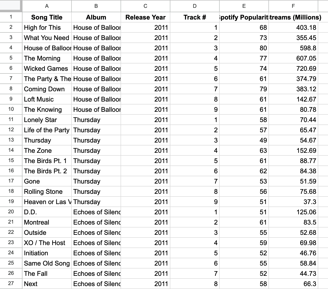
My dataset contains six main variables for each song:
Song Title
Album / Era
Release Year
Track Number
Spotify Popularity Score
Total Streams (in millions)
I compiled the information manually by collecting stream counts from Spotify’s publicly available statistics. Because some albums contain deluxe editions or remastered versions, I standardized the dataset by including only primary versions of songs. I then entered all data into Google Sheets and cleaned it by:
Ensuring consistent formatting for album names
Converting raw stream numbers into millions for easier visualization
Removing duplicates, alternate versions, and live recordings
Matching each song with its correct release year and track order
Adding Spotify’s popularity score as a secondary metric
This organization helped RAWGraphs accept the data smoothly. The column order was carefully structured so that the circle-packing hierarchy would work correctly:
Album → major cluster
Song Title → individual circle
Streams (Millions) → bubble size
Visualization
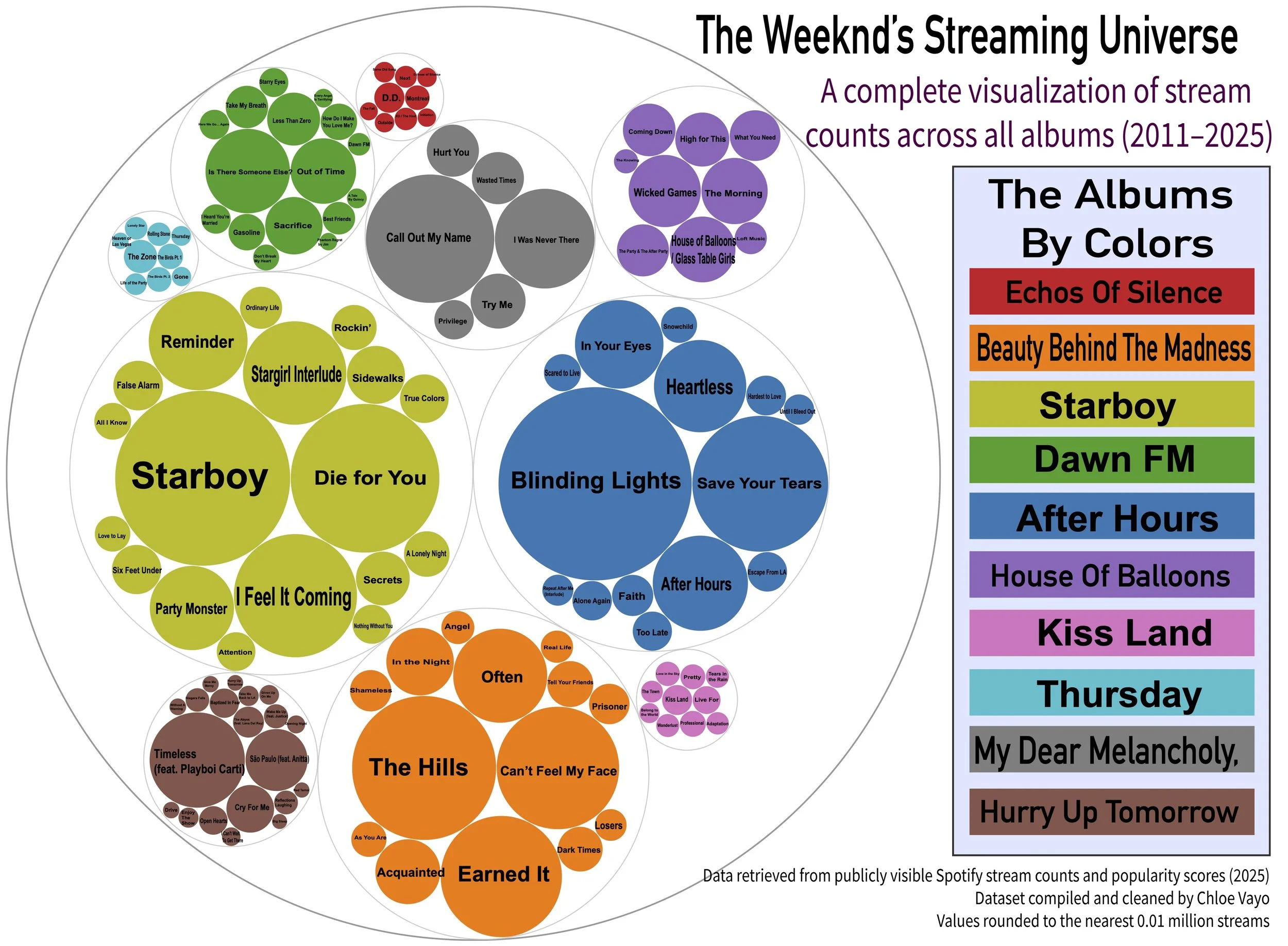
This visualization shows how circle packing can show how The Weeknd’s songs compare in total Spotify streams from 2011–2025. Each large colored cluster represents an album, and each circle inside it is a single song. The size of each bubble reflects its total stream count, so larger circles correspond to more widely played songs.
Overall, the visualization clearly shows how The Weeknd’s career grew from niche R&B mixtapes to record-breaking global pop dominance.
Walk - Through
Starting from the center:
The largest bubble in the entire graphic is “Blinding Lights”, representing over 5.1 billion streams. Its position and size immediately show that it is not only The Weeknd’s biggest hit, but one of the most-streamed songs in Spotify history. Surrounding it are other major hits from After Hours, such as “Save Your Tears”, “In Your Eyes”, and the title track. This cluster shows how dominant the album has been commercially.
Moving to Starboy (green cluster):
Next is the very large Starboy cluster. The album contains multiple high-streaming tracks, especially:
“Starboy”
“Die for You”
“I Feel It Coming”
“Reminder”
This era balances mainstream pop with experimental sounds, which is reflected in the broad range of bubble sizes.
Beauty Behind the Madness (orange cluster):
This group is tightly packed with large circles representing:
“The Hills”
“Can’t Feel My Face”
“Earned It”
These tracks were all massive global hits, which explains why the cluster is made up of consistently larger bubbles.
The Trilogy era (purple, red, and blue clusters):
Albums like House of Balloons, Thursday, and Echoes of Silence show smaller bubbles overall, reflecting their early-career mixtape origins. Songs such as “Wicked Games”, “The Zone”, and “Montreal” still stand out despite the album-era differences.
Newer music: Dawn FM and Hurry Up Tomorrow
The Dawn FM cluster shows steady, medium-sized bubbles, revealing strong but not extreme streaming performance.
The Hurry Up Tomorrow cluster represents his newest material, with standouts like “Timeless”, “Cry For Me”, and “São Paulo”.


Design
To build this visualization, I chose Circle Packing in RAWGraphs because it allowed me to show multiple layers of information at once: album groupings, individual songs, and relative stream volume. It visually represents relationships and proportion in a way that feels organic and intuitive.
Color Choices
I assigned each album a unique color so the viewer can easily see era-based clusters. I used contrasting hues but kept them within a cohesive palette so the graphic feels unified. This also aligns with design principles of categorical distinction, color hierarchy, and visual grouping.
Typography
Song titles are labeled inside each circle. I manually adjusted text size in Illustrator to ensure legibility without overwhelming the bubbles. Larger songs use larger labels to reinforce visual hierarchy.
Layout and Composition
I kept the central hit (“Blinding Lights”) near the middle to anchor the graphic. Albums with many songs (like Starboy) form dense clusters, while smaller albums (like My Dear Melancholy,) remain compact. The outer container circle frames the “universe” theme and adds conceptual meaning.
Accessibility Adjustments
I tested colorblind accessibility using Coblis. Because many viewers cannot rely on color alone, the album legend labels were placed directly beside the colors for clarity. Bubbles were given strong contrast outlines so shape distinction remains even for users with reduced color perception.
Finally, I added: A clean legend, A title + subtitle, and Data sourcing information. These additions help meet both accessibility and professional visualization standards.
Conclusion
This visualization reveals several important patterns about The Weeknd’s career. First, it confirms how dramatically After Hours reshaped his streaming success. The overwhelming size of “Blinding Lights,” “Save Your Tears,” and “In Your Eyes” shows that this era represents the peak of his global popularity.
Second, albums like Beauty Behind the Madness and Starboy form some of the most balanced and consistently large clusters, showing that these eras produced multiple long-lasting mainstream hits. Their bubbles are both numerous and large, indicating stable commercial success rather than reliance on a single viral song.
In contrast, early albums like House of Balloons, Thursday, and Echoes of Silence contain smaller bubbles. This reflects their original release as mixtapes and their gradual discovery over time. Although they are culturally influential, their streaming numbers remain lower.
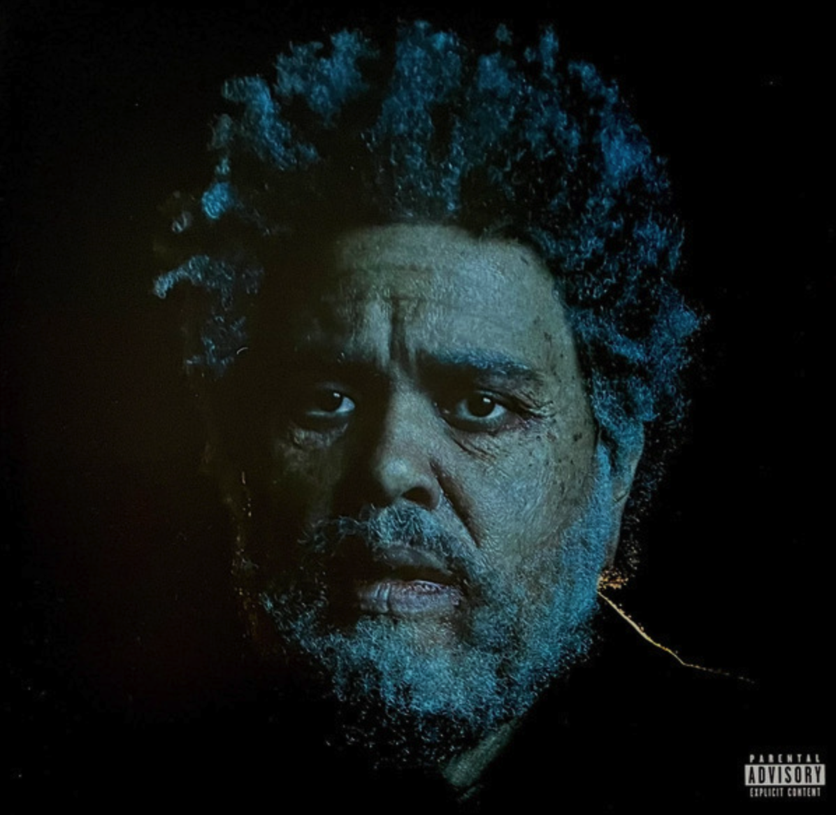
The newest era, Hurry Up Tomorrow, shows a promising spread of medium-high bubbles. It indicates that even more than a decade into his career, The Weeknd maintains strong streaming performance and listener engagement.
Overall, the data suggests a clear trajectory: The Weeknd moved from underground R&B to global superstar, with each era building on the last. My visualization captures this growth and paints a fuller picture of how his music resonates over time.
This project helped me better understand not just The Weeknd’s discography, but how data visualization can reveal patterns that are not obvious when looking at raw numbers alone.